One of the most beautiful albums ever recorded - can be played back-to-back without fatigue.
Excellent. Timeless
From the era when records belonged to artists and not crap marketing departments. A genius album with a title that would be marketing dept rejected and a cover that has to be one of the best to ever keep the dust of a record.
A fabulous concept albume further enhanced by the astounding artwork by Barry Godber. The artwork was universally adopted and must have sold many copies of the album by those mesmerised by its power.
I didn’t buy it when it was released as I didn’t like it. I now played it 10 times back to back as it’s highly regarded just in case I was wrong. But I wasn’t. It’s rubbish. I like the sleeve though. Ron Coro – art direction
Johnny Lee – design. Elliot Gilbert – photography
This is awful. I would have to be off my face to enjoy this
For posh people who don’t like music but think they do
Music is ok in a 1950's vibe. The sleeve is not so nice featuring Primitive Masks from Carlebach Galleries NewYork photographed by Lester Kraus and an average type layout. Standard b/w reverse layout by a printer. Roulette 1958 pressing has good, graphic, generic labels.
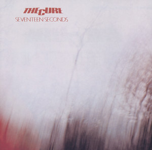
Great music wrapped in an excellent cover designed by Peter Saville and Martyn Atkins. Front layout is well considered with a fine border and some delicate type. The reverse and inner bag have been laid out with care. Factory records allowed the band's name to appear on the reverse and just the album title on the front. Very intelligent and mature attitude towards design from the record company, whilst not towing the major record company folklore about a record not selling unless the band's name was big and at the top of the sleeve. The photograph of the Appiani family tomb in Genoa's Monumental Cemetery of Staglieno was taken by Bernard Pierre Wolff in 1978. The tomb is a large work created & sculpted by Demetrio Paernio in 1910. Various versions printed on different card grades could have been on purpose, but more likely the printer's lack of consistency. Still, the overall package is lovely and enjoying the sleeve is part of enjoying the music.
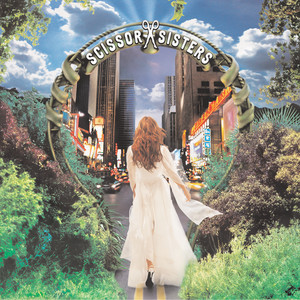
Hmmm - the cover, a painting by Wayne White, is the only thing of value here; the comparisons to Ed Ruscha, just because they both use type, are lazy. Worth looking at Wayne White's other paintings too; even though they are numerous versions of the same idea, they are well executed. Much more interesting than the music.
Music is tragic and the sleeve a horror, designed by the much-respected Paula Scher and illustrated by Roger Huyssen for Epic Records,
Scher, who once designed covers and worked as an art director for major artists such as The Rolling Stones, admits she's “mystified” by the continued interest in this album package. “The Boston cover was designed in 1976 and is now 39 years old,” she says. “It was, and still is, in my opinion, a mediocre piece of work.”
The Atlantic 2015 (edited)
A space-shaped guitar destroying Earth - what were they thinking?
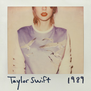
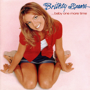
So a record executive has a great idea - use an unremarkable press shot for the sleeve - genius - retouch her teeth and bleach the whites of her eyes and slap some type on the top and another iconic sleeve is born. Larry Busacca, who took the photo, is often not credited.
I'm not sure if this is a good thing or not. He's a bit cheesed.
https://www.instagram.com/p/Bsn8bBLlAE8/
Not much worth listening to on this album unless you like paper-thin lyrics and dull tunes. 'The beat goes on' is a nice song, but this is not a good cover.
Excellent artwork utilising the image created by fashion photographer Vic Singh. It is reported that he was sent an advance copy of the music and after listening to it, wanted to do something in keeping with the bands alien sound so asked the band to bring bright clothes then shot on his Hassleblad using a prism lens that George Harrison had given him. All this in 1967 before the emerhence of computers or heinous Ai. Somewhere theres a piece of film with this shot on and polaroids, capturing the moment in analogue perfection.
Music is great too.
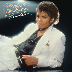
Wow- a proper sleeve - well worth a google to learn more about the dedication of designer Peter Corriston to create not just the cover image, using a raft of talent, but also the complexity of the whole package. this is how record should be, not lazy slapped on type on a press shot. Slevees have much more value than just keeping the dust off Robbo. The story on 'behind the covers' is a good read.
Music is beyond.
A perfect package
Derek Riggs creates the horror cartoons and Steve Harris claims to have created the logo however there are conflicting opinions to that. The best I have discovered so far is that it was an uncredited font by Alphabet Photosetting called Busk(source.fonts in use). Dennis Wiilcok, then a studio manager at Crowes Studio in 1977, ordered the bands name as PMTs (pre computer typesetting was photographic-type physical prints) Allegedly his young designer Ray Hollingsworth adapted it to the Maiden logo. (source dafont.com)There is chatter that Vic Fair designed the bespoke font but most likely is that he was an early user and just ordered the font from the type house. You can get your own version as it was redrawn in 1996 and renamed 'Metal Lord' Usually those with the loudest voice who say it the most often get to claim the credit. Not a great sleeve but good branding . Music is horrible
The album cover for Madman Across the Water was embroidered over two weeks by Janis Larkham, wife of the album art director David Larkham. She used the back of an old Levi's jacket, and the original was gifted to Elton. There was no initial run of expensive album covers with similar embroidery, nor embossed versions; it was flat-printed - ie studio photographed - scanning was in its infancy, so everything was analogue, though it did include a lavish booklet.
Janis chose to credit herself as "Yanis" for this artwork.
(source-https://rachelandersontextiles.com/blogs/posts/seamstress-for-the-band)
Normal whiny Elton John record inside some thoughtful packaging
Bob cato took the album pic. Taking photos was obviously not his bag, but apparently art direction was. For two cover designs Cato was awarded Grammys by the National Academy of Recording Arts and Sciences. They were for Barbra Streisand’s “People” (1964) and for Bob Dylan’s “Greatest Hits” (1967). Allegedly ground breaking at the time. Later, in 1997, the Recording Academy would award Cato its President’s Merit Award. (source Rochester Institute of Technology) - got to say as he seemed to get a lot of credits - must have worked really hard at making sure his name was on it as 'Vice President for Art and Design'.
Music on this record is great.
There is some uncertainty regarding the cover photo with both Joseph Cultice amd Randy G credited in different versions of the release. Who could blame them for not claiming this shocker? Jennifer Barbato was the art director, she has produced some nice work elsewhere.
Music is a horrific as the sleeve.
Why is this crap in this list?
Ed Fotheringham's illustration is the cover art here and supposedly his crazy chaotic style suits the music. Cover is ok but the music is better and darker than the cover. I didn't know this band so thanks 1001.
Theres a YouTube video by Hugh Syme about how he came up with this sleeve, photographed by Deborah Samual, a friend, who also appeared in one of the framed images as Joan of Arc, allegedly the photo session was a druken fun affair. Hugh also won the Juno award for best Album. WTF terrible album wrapped is a silly cover.
Art Direction & Design: Jeri Heiden and Glen Nakasako aka SMOG Design. Photography: Miranda Penn Turin. This was a pretty succesful repositioning exercise for Christina, moving her from bobblegum to Xtina, a more uninhibited, sexually liberated personality. While not ground breaking the sleeve is good, solid and well crafted, shame the music is crap.
Album art direction by Randall Martin, still working, and photography by Jeffrey Henson Scales, who is a legend. Got to say I really liked it when it came out as it was very distinct with lots of personality, just like the music. Hadn't listened to in years but quickly remembered how good it is. Another good combination of music and sleeve.
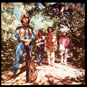
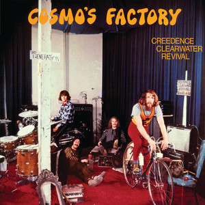
The cover art, design, and photography were designed by Bob Fogerty, brother to John and Tom Fogerty.
Rock critic Ralph Gleason referred to CCR as an excellent example of the "Third Generation of San Francisco bands" so they included a sign saying "3RD GENERATION" on the cover.source - Goldmine magazine
It would have made this excellent cover even better if they had integrated the title physically into the photo.
Still all in all a fabulous album and sleeve.
This was the first of three covers by Don Brautigum, who previously painted Metallica’s iconic Master Of Puppets. “Poltergeist had a very strong visual image to me and I liked the way it looked,” Charlie Benante, the drummer, explained to PureGrainAudio. “I was always into horror, and Among The Living was basically about good and evil. It was just about how much evil there is amongst us.” Charlie Benante. Seizing control of the band’s aesthetic after the widely-ridiculed Fistful Of Metal sleeve, Benante has conceived, overseen and approved every image the band have since stamped their name on, tracing an artistic line from the garish excesses of the 80s, through the moody, minimalist 90s, to the hip superhero likenesses and ‘Pentathrax’ insignia of their post-millennial graphic design. In 2016 Charlie told Artist Direct “That’s one of the reasons I still take the time and effort to make an album cover: I want our audience to get lost in it.” source Loudersound.com
Who is he trying to kid? Don Brautigum has some skills and using the same illustrator for 3 sleeves gives some continuity, but the sleeves are horribly immature.
The iconic logo for the American heavy metal band Anthrax was designed by their former lead guitarist, Dan Spitz. He created the classic text-based graphic for the band in the 1980s. Source logos world.net
Love it or hate it, its spelt correctly and its repetitious use for merch will be the envy of many a worldwide brand.
All of this is great if you like grown men shouting while aimless tuneless noise fills the background.
Maya Arulpragasam and Steve Loveridge, having met at St Martins, created the artwork in photoshop with very little understanding of the program, which gives the sleeve its charm.
source Under the covers- Eye on design 2020
I missed this when it came out and both artwork and music are excellent and well paired to each other.
M.I.A seems to have pissed off quite a few people and currently has been sacked from the Kid Cudi tour.
his words ‘I Won’t Have Someone on Tour Making Offensive Remarks’
Am I still allowed to like this album?
The album's sleeve was designed and art directed by Andrea Klein and the photographer was David Michael Kennedy. The chosen photograph was not actually taken in Nebraska; Kennedy had captured it during a road trip through a winter snowstorm in Colorado in December 1975. source Santa Fe New Mexican. source amateur photography
The capitalized red letters offer a bloody imagery to the already dark tone of the album’s artwork and music. Springsteen himself described the album by saying, “It was all just very bloody in its own way.” source various.
Not being a Springsteen fan I was ready to hit the 1* button but having played it through I find myself liking it. How did that happen?
The album cover and design for Tim Buckley's 1967 masterpiece Goodbye and Hello were created by legendary Elektra Records art director William S. Harvey. The front cover photography was shot by Guy Webster. (wiki) Did we need another press style headshot with a bit of type stuck at the top? Its a decent enough photo but nowhere as good as the music which is hauntingly good. Died at 28 and left us with Jeff.
Cover photo by John Bryson which is so-so and the cover design and art direction by Ed Thrasher., which is so-so too. However Ed Thrasher has designed/ artdirected/ photographed some amazing album covers over the years,He should be a household name. I'm not a Frank fan but on a sultry summer evening this album was perfect and I found I liked it much more than I imagined I might. it set the mood so well and I had a glimpse of why the old crooner is so revered - what a plesant surprise
Designed by Ken Deardoff, with front cover photography by Donald Silverstein, who also shot the famous Jimi Hendrix photo we all love. Its quite difficult to find out much more but he was obviously a good snapper, theres a group shot in the NPG too with Terrance Donavan and David Bailey. Theres no wiki page on him. Music is what you expect when you walk into a smart hotel bar in NY. Lots of people love this and its ok, comfortable and dull.
Cover art credits for a cliche mundane sleeve as follows. Howard Fritzson art direction Monica White – artwork
Don Hunstein, David Gahr - photography. This album has legendary status but not for the sleeve. Music is as expected but the lyrics are magical and very moving with Willie Nelson’s delivery creating something very special. Enjoyable if only listened to once.
According to Wiki the album cover art wasdesigned by English illustrator Spookytim (Tim O'Brien) from the Brighton-based studio Studiospooky, with art direction by Fury*- which is ok, perhaps even quite nice - However I realised as I was listening to this that it was in fact an Elton John record with some clever attempts to disquise his voice, Think Gorillaz and Blur, this is Eltons Gorillaz, but those tell tale whiney vocals and over plump productions gave the game away-hah Elton you dont fool me, its another 1*.
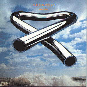
The legend that was Trevor Key was usually dismayed when introduced as "the photographer who did the Tubular Bells album cover", it says on the website created in his memory. Trevor told me how he created the image 'in camera'. It was a long time before Photoshop, and even the talented John Abbot might have struggled with the reflections of this as a two-part comp with a sea background. There are other versions by Trevor too and newer ones for follow-up albums. This album smashed the genres when it was released, but without a recognisable single, Virgin had no idea how to market it. Luckily, its inclusion in The Exorcist film propelled it to a huge audience. Thankfully they didn't insist that Mike appeared on the cover. Another example of the quality of the sleeve matching the quality of the album.
The sleeve design for ABBA's 1976 album Arrival was conceived by Rune Söderqvist. Photographed by Ola Lager. Logo designed by Rune Söderqvist apparently after a shoot where the members held a letter each and Benny's was the wrong way around.
The sleeve has been criticised for showing the band ‘untouchable’ behind glass and rather than arriving, about to depart. Apart from this idea done badly there is also the issue of the ultra heavy amateur black airbrushing and the crude masking. What a horror show. At least it matches the vile music. I was tempted not to listen to this as every time i have had to listen to this I cringed but I thought ‘give it a fair chance after all this is what this whole 1 a day is about, and I was a Bruce hater until I listened to Nebraska, however no reprieve for Abba - what a cringe.
Peter Barrett is a well established cover designer even if this is not an award winner, Andrew Ratcliffe is a painter. There are some really nice images on his website. This one isn't included. Kevin Roland and Dexys made this album. Why its on the 1001 baffles me.
The cover concept and design for The White Stripes' album Get Behind Me Satan were credited to The Third Man, with layout and design execution by Arthole Design. The photography featured on the packaging was shot by Ewen Spencer. (wiki) It's ok if you like red, black and white sleeves with some obvious symbolism related to the title. I have seen better photos by Ewan. So an in-house sleeve most likely conceptualised by Jack. Music is fine.
Mike Mills is best known for his independent films 20th Century Women (2016), Beginners (2011), and Thumbsucker (2005)(Lark Creative) but he has many other high quality creative projects including sleeves and promos, well worth a google. This has to be one of his most memorable and striking covers. Suits the music perfectly.
Before pursuing a full-time career in music, Stevens attended Hammersmith College of Art in London to study painting and illustration, (Far out music). Although in the 1970s this type of sleeve was standard fare for this type of music, Island Records were renowned for letting artist create their own artwork with minimal interference so this would be Yusuf's vision. Fits with the music.
Eric Hayes took the photo of Denny’s parents standing in front of the family house in Wimbledon, London, with the band lounging on the lawn in the background. With no type on the front, this is perfect. A good photo is always a good photo, and this one is excellent, wrapping an excellent album. Shame the American record company fell out with the band and replaced it with a photo of performing elephants.
Sleeve and package design by Jean Krikorian, art direction by Rich Frankel.
Super talented photographers Melodie McDaniel, Peggy Sirota, and Scott Henriksen all contributed, underscoring A&M's belief and commitment to Cheryl. However, faced with an uninspired choice of image, the AD and designer embarked on graphic overkill in an attempt to rescue it from sitting alongside other mundane head-and-shoulders portrait sleeves. Six videos were also made to help promote the album, which questions the need for a headshot on the cover. Cheryl has a nice voice and seems a really genuine, good, and lovely person. Just can't like the music, and having listened to it once, I won't choose to listen to it ever again.
According to Wiki, citing an unnamed source, the album's cover artwork, designed by King, shows the influence of the Situationist International, the left-wing organisation that became famous for inspiring the events of May 68 in France. That's a big leap, and it's more Glen Baxter without the Stetson, IMHO. Like the music a lot though.
‘Blondie is a group’ was this bands mantra, which then is a bit weird to call yourselves ‘Blondie’ when the only blond is the lead singer. However, so the story goes, manager Peter Leeds deceived the band. They only discovered when they received the finished product that he had made an executive choice and used his ‘concept’ version of the front cover to be printed - they fell out big time. This, the third album became their big breakthrough and enabled the band to jettison Peter Leeds for a more respectful manager. He wouldn’t have cared as under their written termination agreement, Leeds was entitled to post-term commissions on the band's gross earnings from pre-1985 works and existing contracts, netting him millions over the years.
The professionals were - Art Direction & Design: Ramey Communications. Photography: Edo Bertoglio. Lettering: Jerry Rodriguez
(Sources Farout, Q mag, Justia, Discogs)
We all bought this, we all fancied Debbie Harry, no-one knew the names of any of the boys in the band, we all thought it was all about her. We were all a bit disappointed in the album.
Listen to this in the original mono, and the sleeve is in colour where mono would have been more suitable. The Sleeve design by Haig Adishian, front cover shot by Irving Schild.
Art school intellectual or pretentious? I’m still not sure. Its not on my playlist. Quite like the sleeve though a collaboration created by Ann Kinney, Carl Grasso, and Sandra Lee Phipps and Michael Stipe of course.
Horrid sleeve, horrid music.
Excellent artwork by David Juniper, a fellow student with Page at Sutton Art College in Surrey. Perfect for this exceptional album.
photography by John Ingledew but the band designed the sleeve themselves. Fits the music perfectly. Just awful. Are there so few albums of quality that this is considered good?
The portrait photo was taken by Jeremy Ngatho Cole, who co-directed the entire visual campaign alongside Little Simz.
Music with this many awards is always difficult to listen to without being affected by critics. I didn’t like the first track and was ready to give it a low rate but I stuck with It and it’s good. The sleeve is good too.
Cover Art Direction: Tony Lane & Nancy Donald
Cover Photo: Dick Zimmerman
Design Lyrics: Mac James
Design Style: Gretchen Valade & Design Pool
Lots of people credited here. It’s worth reading the article by Dick Zimmerman about this famous photo shoot; you couldn’t make it up.
Sleeve nope.
Music nope.
Just say no.
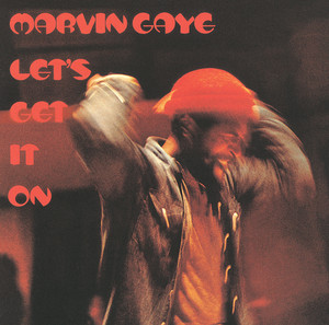
Curtis McNair should be a household name for designing and art-working a generation of Tamla’s sleeves, single handedly, and in doing so creating an identity for the label that many will be familiar with. Averaging 25 album covers in a year, plus who knows how many singles, on shoestring budgets, is quite an achievement. They’re not all great, but most are good, and as they clothed some of the best music ever made, some gained legendary status. This one included.
https://baystatebanner.com/2008/12/18/the-man-behind-motowns-image/
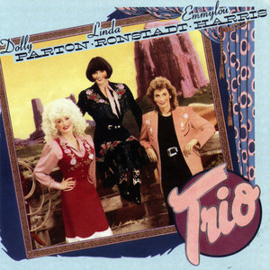
Art Direction & Design: John Kosh and Ron Larson
Photography: Robert Blakeman
Costume Design: Manuel
Illustration: Andy Engel
Dolly just died
The photo is a horrible press photo; the illustration is horrible; the hand-drawn type for Trio is horrible; the letraset for the artists' names is horrible, and the music is horrible.
From all accounts, the artists are nice people and highly regarded within this genre.
I listened to this all the way through.
The album cover is a black-and-white photograph taken by Steve Schapiro on the set of the film The Man Who Fell To Earth. I cannot find a credit for the excellent typography, which perhaps was put together by the record company's in-house art dept. But whoever it was who converted the more pedestrian colour image to black and white, framed in a thick white border and then added the bold, no-space all-caps type needs a pat on the back. A fine piece of work to wrap a fabulous record. It doesn't get better than this.
Femi Kuti was a strongly opinionated person, killed by aids, which he denied existed. His loud opposition to the Nigerian junta also had tragic consequences. Lemi Ghariokwu the Nigerian illustrator and graphic designer created the cover featuring robotic, stiff Nigerian soldiers to depict Fela's satirical critique of the military blindly obeying orders. Quite amazing backstory. Femi has been credited for popularising afrobeat. Sadly I don’t like it.
Ok sort of post punk sleeve designed by Danish painter Claus Castenskiold and British photographer Michael Pollard. Music is ok even though it reminds me of The Stranglers.
The artist Condos record sleeves for Kanye have been frequently cited among the best and most iconic rap album covers, listed alongside Nas's Illmatic and The Notorious B.I.G.'s Ready to Die, and it is catalogued in the People's Graphic Design Archive as a recognized work of design. There’s a lot more information on ‘ behind the covers’ website. Kanye is trying to disrupt and push the boundaries. Although Condo’s work is strong and thought provoking its tainted by Kanye as it seems is everything he touches, from his partners to his $57m Tadao Ando Malibu home. I wonder if the talented musicians on this album are now regretting their involvement. Some of the music is excellent. Kanye however…
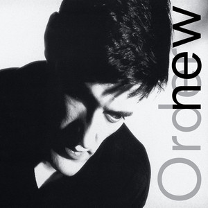
George Underwood, Bowie's school friend, designed Low's cover artwork. featuring an altered still frame from The Man Who Fell to Earth. Excellent cover, excellent album.
Loretta was born to a poor family but died a wealthy woman, and her albums totalled sales in the millions. She was a well-loved star.
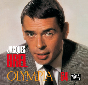
Doesn't look like any money was wasted on the sleeve; Hal Buksbaum's publicity shot had some run-of-the-mill type added to it, and off it went.
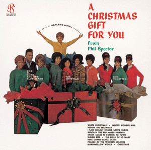
I am confused about this site; are we listening to the best, or just an example of a popular artist? Is White Christmas by Bing Crosby going to appear soon? Or the soundtrack to The Bodyguard? Un Verano Sin Ti by Bad Bunny? Ed Sheeran - +-=÷×?(37 billion streams to date)
Please don’t make me listen to this again. I thought the only good part of this project was the cover but a little digging suggests the album artwork borrowed the serpent from the Symbionese Liberation Army (SLA) flag/banner, alongside the phrase “Death to the fascist insect that preys upon the life of the people!”
Striking cover and monoprint design by artist Linder Sterling, with photography of the band by Adrian Boot. Some excellent tunes with a hint of Buzzcocks.
A Bill Narum design with photography by Galen Scott. The inside gatefold Tex-Mex feast spread is the highlight of this album. The songs all sound the same which is fine if one comes on the radio but not when you have to listen to more than one.
Early in 1971, before American Pie was recorded, Mediarts sent Don McLean to Los Angeles for cover photographs with George S. Whiteman. If you have to have a photo of the artist on the cover this is the way to do it. The album is devine.
Kaare Andrews is an award winning comic book artist. We all have off days. Dave McCaig, another award winner, designed the logo on one of his off days. Radiohead chose Beta as their support act. Three off days in a row. At least the band were aware of what they were doing and declared one of their earlier recording as “fucking awful” couldn’t have put it better myself.
Cover design by Aimee Macauley.
Photographers Danny Hastings and Danny Clinch are both credited with taking the often-cited, groundbreaking use of a child image in rap cover history, and awards have been won. Its not for me. Music is well liked too. It's not for me either.
Cally Callomon – art direction, design
David Alvarez – art direction, design only they know what they did. Not my favourite sleeve but music is sublime.
Slim Smith gets the credit for the reworked Werner Peiner's 1944 painting of 'A Demon of the Hour' and the stencil type, too, perhaps? Is this the Iron Sky soundtrack or a Slovenian Eurovision entry? Neither or both; either way is just plain silly. On this list to show the breadth and depth of musical offerings?
Aldo Luiz – cover art
Jorge Vianna – final art
Orlando Abrunhosa – photography
Unrecognisable portrait, so Aldo put big type on it.
Nothing to dislike about the music, nothing to like either.
Illustrated by artist Ian Beck, with the overall packaging and package design handled by David Larkham and Michael Ross is all good. As one of the handful of records on constant rotation by my school friends this album was imprinted into that period of our lives. Although I dislike the whiney Reg Dwight immensely the music is compelling and impossible to give the 1* planned. dammit.
The Front Cover features a striking, minimalist "dead gold" background containing nothing but the band's name, the album title, and their iconic petroglyph logo. Because they had very little money for artwork, the metallic design served as a stark, industrial statement. This according to 'stamp the wax' or they were just lazy and couldn't be arsed to put together a decent sleeve. Was expecting, from the reviews, for this to be less tuneful. However, theres an integrity and thoughtfulness to this album. Ok its an art project so its difficult to gauge alongside what else is on here but compared to Kid Rock this is sincere and genius. Not for heavy rotation but not to be discarded as noise.
Foothold did the layout but the image making by Maria Mochnacz is genius. In her words “It is a colour photocopy. No negative, cost about 10p, the first shop we went to wouldn’t let Polly put her face on the photocopier and said it wouldn’t work because she would move a little between scans —-but that was what I wanted, a bit of raw smudgedness, so we went to central library in Bristol and did it there.” This was an early version of a type of image making that Katerina Jebb has mastered and developed into an art form. Music is just as raw and vital as when I first heard it. Well done all of you for creating stuff that’s so good.
The sleeve for The xx's debut album xx was designed by band member Romy Madley Croft alongside designer Phil Lee. Sleeve is ok, Music is nice.
It seems that Mike Scott made this sleeve himself, which, compared to the ones created by graphic designers, is very apparent. It's a generic route, ok but not great. After The Whole of the Moon and This is the Sea, Fisherman's Blue follows the same recipe but not as tasty. All of The Waterboys' music is very enjoyable and great to have spinning on the turntable; however, if we are voting for great albums this is an also-ran.
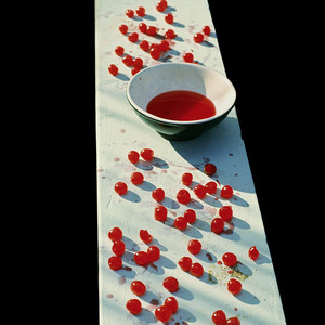
Linda McCartney’s photo is the cover, designed with Paul, Roger Huggett and Gordon House. It’s very striking and emotive. The album, however, apart from the excellent studio version of ‘Maybe I’m Amazed ’, seems to be a set of well-produced and crafted songs that were never good enough to be B-sides. I’m not sure this album is relevant to 1001 albums, or at all.
The Credits as written on the packaging
* Mark Farrow – graphic design
* Pet Shop Boys – graphic design
* Chris Nash – photographs
* David Fielding – costume and set design
* Pentagram – Lego case CD packaging, concept, design - Daniel Weil
Mark Farrow won a D&AD award for one of his Pet Shop Boys sleeves. Not this one. I remember when this came out, and we all gasped at how outrageous it was as a sleeve. Didn't buy one as the music is hideous.
The original art direction for The Beach Boys' 1971 album Surf's Up was credited to Ed Thrasher. The front cover features an anonymous, based on End of the Trail, a early C20 sculpture of an exhausted Native American warrior on a weary horse by artist James Earle Fraser.The painter of the version on the album cover has never been identified. Jack Rieley, the manager, says he discovered the painting in a Silver lake antique shop and its mood fitted the band's new artistic direction. The painting is great the music not so.
Dean Freeman who took the photo , is the son of Bob Freeman who created the first 5 Beatles album covers. Supposedly it’s a homage to 50s glamour portraits. Mike Owen does it much better. The Smiths albums are ingrained in students lifestyles and are rightly considered groundbreaking. Morrissey’s vocal is still delicious on Vauxhall but much too loud and the music is horrid. Not sure why this is in the 1001?
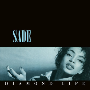
The sleeve design for Sade's "Diamond Life" was created by Graham Smith, with photography by Chris Roberts. A normal sort of sleeve for the era. Remembering Sade at St Martin's, it was a shock when she became famous, and perhaps we were in awe of her success. I always thought I really liked her voice, the songs and the music, but now I realise why none of us owned the album.
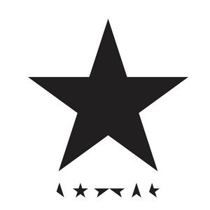
Cover was designed by Jonathan Barnbrook. Route One design, but at least the marketing department was ignored, and the name and title were not written in big letters across the top, too, so the sleeve has a good graphic quality. Supposedly, the bits at the bottom spell the name. Not my favourite Bowie album, but still head and shoulders above most of the other drivel that's on 1001.
The cover design was credited to John Berg, with the photograph shot by Steve Paley
In the 24k gold disc reissue of the album, Scott Galloway recounts the story of the original album cover liner notes:
'In an interview with Jonathan Dakss... Sly definitively explained his concept for the cover art as it related to the overall theme of the album:
"I wanted the flag to truly represent people of all colors. I wanted the color black because it is the absence of color. I wanted the color white because it is the combination of all colors. And I wanted the color red because it represents the one thing that all people have in common: blood. I wanted suns instead of stars because stars to me imply searching, like you search for your star. And there are already too many stars in this world. But the sun, that's something that is always there, looking right at you. Betsy Ross did the best she could with what she had. I thought I could do better."' Pretty good . With the record company panicking about the lack of text on the front, they slung on a sticker in the shape of the sun, “Featuring the Hit Single “Family Affair.” Just to dumb it down a bit. Probably as good as a sleeve get thanks to complete creative control of the artist. Not music that I enjoy but this resonates with so many people and has such cultural importance and integrity. Its exactly what popular music can and should do, challenge us. So although I will most likely never play it again, it must be a 5 star album. And definately one we should all hear. thanks 1001.
Amazing cover by the legendary Barney Bubbles. Record drones on forever. You either like Hawkwind or you don't. I do.
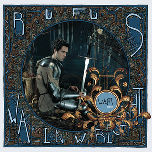
The album cover for Rufus Wainwright's Want One was designed by Janet Wolsborn and Rufus Wainwright himself, with cover artwork created by Wainwright and photography by Yelena Yemchuk.
The medieval knight theme on the cover of Want One represents a typically masculine, valiant view of life. According to Rufus Wainwright, the imagery reflects the personal struggles he was navigating at the time, particularly his recovery from crystal meth addiction and his complex relationship with his father, Loudon Wainwright(haunted jukebox) Themes including Slaying Personal Dragons:The Triumphant Hero:The "Yin and Yang" Duality.
What drivel. Music is horrid too. The only good thing about this album is discovering Yelena Yemchuk's work, which is really good.
Me Company graphic design Photographer Jean-Baptiste Mondino. styling by Judy Blame.
Amanda Lear appears on the cover, her hair by smile or perhaps Antony Price as he was a talented image maker who made and styled the clothes and quite likely applied the make up or at the very least art directed it. Bryan, fine art trained, takes credit for the idea with the help of his contemporary Nick De Ville and photographer Karl Stoecker. CCS put the artwork together. It was compulsive at the time along with the music, with shades of Bowie it is still mesmerising.
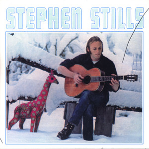
Gary Burden specialised in album covers design and is considered a pioneer of the concept of album cover art. He won a Grammy and was nominated for others. Not for this one though. The cover of Stephen Stills' 1970 self-titled debut album was photographed by Henry Diltz. The use of a press photo even Stills realised was going to be dull so he brought along a strange coloured giraffe to spice it up. This is a marketing dept design with the type big at the top and a ‘wacky’ press type photo with the artist clearly depicted singing while holding the principal instrument of his work. Even the thickest fan would understand what they were about to buy. Music deserved a better cover.
Joni Mitchell's painting "The Mountain Loves The Sea," is on the cover with art direction and design by Anthony Hudson. Its her record and she can do what she likes.
P.R. Brown designed the album artwork with photography by Dean Karr after pitching an idea to Marilyn. It’s not nice. Not being a fan of the whole Marilyn Manson aesthetic, I was surprised at how much I liked the music; even the screaming, thrash bits were quite pleasant.
Nick Cave carefully wrapped his exquisitely mournful work in an image by Tom duBois, helped by Hingston Studio. As others have said before, this is art made with voice and music.
I feel guilty for not giving this 5 stars, as obviously so many people love this band. But I think the colour thing is hackneyed, and I can't like listening to Jack's voice.
Cover designed by Karl Klefisch with band member Ralf Hütter inspired by Russian Suprematism and Constructivism, specifically the work of artist El Lissitzky. Great all round
Both cover and music are dull
Everything about this is hideous. If this has to be in the 1001, I might give up now after 250.
I cannot like the music, but there is this really interesting piece by Paul West, the designer, on the process of designing the sleeve and the subsequent involvement with Marc Jacobs.
https://paulwestart.co.uk/blog/artwork-for-cocteau-twins-heaven-or-las-vegas-exhibition-marc-jacobs
Filmmaker Gus Van Sant photographed in the solarised style of ManRay and created the artwork arranged around artwork by a Dutch tattoo artist Hendrikus “Henk” Schiffmacher. If the record company insists on a band photo then this is a good solution. That anyone thought making this record was a good idea is a mystery.
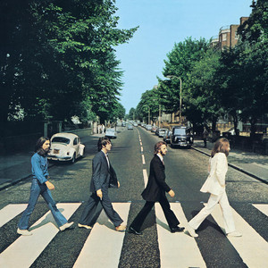
Apple Records creative director John Kosh designed the album cover with a photo by Iain Mcmillan from a McCartney sketched idea. Amazingly, but unsurprisingly EMI believed that the record would not sell without the name and title on the cover. So here we have it - an example of the prerfect combination of band photo and music. The image, shot in 10 mins, is both arresting and striking and would have become a memorable image without the beatles being a part of it. With them it has become a much loved and still copied favourite of fans everywhere. Its worth a trip to the Abbey Rd studios on a quiet Sunday to see the crowds taking turns to re-enact the crossing photo.
Yuk
So Barry made this to get some work writing film scores, and he succeeded so good on him. However the sleeve is a tragedy and at times I thought I was listening to an Casio keyboard demonstration. If this is all 1001 has to offer I might look elsewhere.
Sleeve designed by the band's longtime collaborator, artist and designer, Dave McKean. Type is lazy, and the painting a poor illustration. The sound, which is a better description of Nick Cave's art than music, is horrifically compelling. Like it or loathe it, this is a record you should hear.